Showing posts with label Brittany Brannelly. Show all posts

Tuesday, September 22, 2015

Brannelly Final Presentation


FINAL WRITTEN PRESENTATION | HABITAT FITNESS MAGAZINE
Designed by Brittany Brannelly


ABOUT THE ISSUE
Habitat Fitness Magazine is a monthly publication focused on helping young women live a more active and healthy lifestyle. This publication of Habitat is focusing on “The Future of Food” and the new revolution of healthy eating that will change how people relate to food. Furthermore, as this is the December issue, Habitat has chosen to incorporate a beach theme; as the saying goes: summer bodies are made in the winter. With the dreary winter weather upon us, readers will be enthusiastic to delve into a magazine that will let them escape into the upcoming dreams of summer.

ABOUT THE AUDIENCE
The target audience of Habitat Fitness Magazine is fitness enthusiasts. This particular audience roughly spans the ages between the early 20s through late 30s. Habitat focuses mainly on the female population of this audience. These individuals are focusing on changing their lifestyles by eating healthy, working out regularly, and encouraging positive self esteem. Fitness fanatics are not keen on fad diets. This lifestyle change is not about losing weight, but rather it’s about becoming strong, fit, and healthy.

CONTENT DRIVES CONCEPT
After significant research into Habitat’s competitors (Women’s Health, Fitness, and Shape), it is apparent that these fitness enthusiasts are interested in a publication that not only educates them but also inspires them. These women are looking for new ways to shape their minds and their bodies that will create an overall healthy and happy lifestyle. With this is mind, Habitat strives to present current news, healthy recipes, invigorating exercise plans, and self esteem boosters. With the chosen content, design methodology and grid structures were imposed on the magazine.

For the color palette, colors are sampled from images of fruits and vegetables. Colors create a fresh, organic approach that will target this youthful audience. Furthermore, these colors were chosen because they compliment each other. The three primary colors: navy blue, tomato red, and organic green work well separately (to define departments) and together as a pairing. The muted blue and light tan chosen as secondary colors offset the boldness of the primary.

The typography choices will speak to a modern audience and will include vertical, bold, wide sans-serif fonts. These typefaces relate well with fitness fanatics because they want to embody strength and stability. Nothing speaks more to those attributes than upright and evenly kerned typefaces. The use of Helvetica Light, at 11-point font size, for the body copy will be legible and will let the words speak for themselves. For departments, the typeface A Love of Thunder will be used for headings, in varying colors, and Avenir Next Light for subheadings to keep consistency throughout the publication and identify the article as a department. Furthermore, the contrast of thick headings with thin subheadings offers a visual hierarchy to be followed. For cover stories, different typefaces will be used depending on the tone of the article and to allow it to appear as something unique to that issue.

For image selection, this audience wants to be inspired and inspiration comes from seeing others in their atmosphere. Images of women working out and showcasing strength are vital to this magazine. The cover image should represent who the audience is now and who the audience wants to become. For this issue, images of food should be selective and highlight the importance of eating healthy and avoiding unnatural ingredients. Furthermore, for consistency, images should utilize the publication’s color palette, as well as its brightness and vibrancy. Lastly, images should be intentionally cropped and angled to allow the images to enhance the text. Full-page images will grab the audience in and make them want to know how they can become that person, how they can make that recipe, or how they can better educate themselves about the world we live in.

Lastly, in addition to the departments (trending now, healthy eating, fitness, and lifestyle) Habitat Magazine will include the following: Editor’s letter and advertisements. The Editor’s letter is another way to inspire readers. These fitness fanatics strive from hearing others’ stories. Advertisements will be selected specifically for the needs of this audience. Young women in today’s world want to look and feel their best, which is why Kate Hudson’s Fabletics line is the perfect mix between fitness and fashion. Additionally, Habitat’s audience is always looking for workout partners and inspirational trainers, which is why Equinox is the best fit for them.

Habitat strives to show women that strong is the new sexy, fit is the new thin, and happy is the new healthy.

FINAL SPREADS


Wednesday, September 16, 2015

Brannelly Spreads PLEASE CRITIQUE


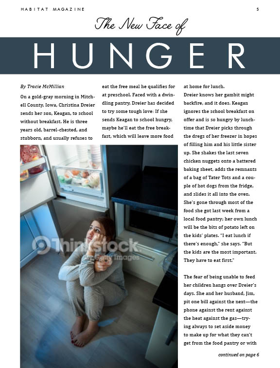
Hello Everyone! I hate MIS as I am sure most of you do as well. I am sending my final PDF to Staples this afternoon/tonight. Here are my final spreads. I REALLY would appreciate any and ALL feedback on last minute tweaks/fixes or any major problems. I am 95% satisfied and just could either use some critiques or some reinforcement on what did work well. Thanks!

Brannelly Last Minute Feedback


Hey I know I am cutting it very last minute. I am sending my final versions to the printers tomorrow afternoon (well actually today as it is very early morning Wednesday right now), so I thought I would ask for any final feedback on some of my department articles. The recipe and the workout will appear as a spread that is why I chose not to keep the split image design theme for the workout page. I thought it would be too much and one of the pages needed to be toned down. Any and all feedback, hopefully early, is appreciated! Thanks! :)

Friday, September 11, 2015

Brannelly AD and DEPARTMENT Updates


Hi guys! I was hoping to get some feedback on these two pages. The first is an ad for Fabletics. I tried to keep it very similar to the actual branding style of the company. It will be a left-hand page next to the TOC. The second is my complete re-work of a department article. This will be a right-hand page sitting next to the "From the Editor" page. Any and all comments are appreciated :)

Wednesday, September 2, 2015

Brannelly TOC

Hey guys! A reminder of my target audience: fitness enthusiasts, ages early 20s to mid 30s. Let me know what you think of this layout for my TOC. Any and all feedback is much appreciated! :)

Wednesday, August 26, 2015

Brannelly Cover Rework

Hey guys! So during my design brief presentation I got mostly feedback on the design of my cover. It was suggested that I need to incorporate more color into the cover by adding a background behind the athlete. I tried a few different scenes: beach, gym, park, and forest. I also added the original with no background. Which background works the best and would target my audience best? Do you guys have any other ideas of potential background scenes that would work better? Again, my target audience is fitness enthusiasts ages 20 - 35. Lastly, the masks and cropping will be improved once I download the high res images, obvi :)


Monday, August 17, 2015

Design Brief Example - Brannelly

Hey guys! Coni asked me to share my design brief with you. Let me know if you have any questions! :)


Wednesday, August 12, 2015

Brannelly Exercise 3 COVER


As a reminder, my target audience is fitness enthusiasts. I researched fitness magazine covers such as Shape, Fitness, and Women's Health. For my first cover design, I tried to intimidate a traditional fitness magazine cover featuring an athlete in top notch shape. For the second cover, I wanted to play with the idea of promoting healthy eating. For the third design, I wanted to showcase just the food. Which variation do you think works best? For all three designs, I chose to use bold, vertical, sans-serif typefaces for the logotypes and the headings because they showcase modernism, strength, and structure which are all qualities that can be associated with my audience. Most colors were extracted from the images themselves, but the softness of the palette is something I want to continue throughout the magazine because fitness fanatics focus their "diets" on organic, all-natural, healthy foods and this color palette mirrors that lifestyle. The more feedback, the better. :)

Tuesday, August 4, 2015

Brannelly Exercise 2 FEATURE


For the Feature spreads, I tried to keep the look and feel similar to the ones I started when I created the one-page features and one-page department articles. Again, my target audience is fitness enthusiasts ranging from early 20s to mid 30s. I want to incorporate images of healthy alternatives to delicious favorites. I want the typography to be dynamic, engaging, and modern. All colors have been pulled from the images chosen to create unity. I think I know which spread I like the best, but I am curious to see if you all choose the same.


Monday, August 3, 2015

REDO Brannelly Exercise 1


For the first assignment I was one of many that used the given grids with the feature body copy rather than the department copy. I have re-done exercise 1 with the correct copy. I was hoping for some feedback on these layouts so I can revise one before printing it and bringing it to class on Thursday. Let me know which layout you think works best because I am having trouble picking one. As a reminder, my target audience is fitness enthusiasts, ages 20-35.

Tuesday, July 28, 2015

Brannelly Exercise 1


For my Habitat Magazine, my target audience is people focused on living the "fit life." Many fad diets have lately been replaced with new high-protein, weight-lifting, fitness lifestyle changes. Instead of dieting to shed unnecessary weight, these fitness advocates are aiming at a complete lifestyle overhaul that will make them healthier and stronger. Strong is the new sexy. This audience is early 20s through mid 30s and are very active people. I tried to use many strong modern typefaces and fitness focused images to grab their attention. Let me know any and all feedback. Thanks!