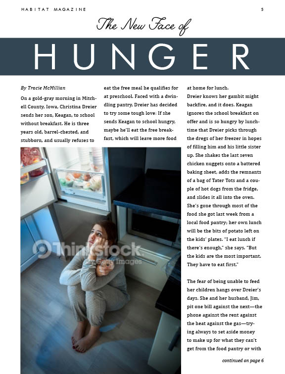
For my Habitat Magazine, my target audience is people focused on living the "fit life." Many fad diets have lately been replaced with new high-protein, weight-lifting, fitness lifestyle changes. Instead of dieting to shed unnecessary weight, these fitness advocates are aiming at a complete lifestyle overhaul that will make them healthier and stronger. Strong is the new sexy. This audience is early 20s through mid 30s and are very active people. I tried to use many strong modern typefaces and fitness focused images to grab their attention. Let me know any and all feedback. Thanks!


Brittney I love this so much!!! I love your audience! I find it very unique and different! I think it will be very empowering for women and a good motivation to keep them going.
ReplyDeleteThe typography use works so well in each layout! I think you did an awesome job selecting the right typefaces to get the right tone and feel.
Its so hard to pick one as my favorite because I love all of them! But I would say the second one. Because I love the use of stacked typography. This looks fab! Good job!
So I’ve talked to you about your different designs in person, but I’m going to say it again, I really like these designs. My favorite 2 are the first 2 especially the first one. What I think works so well with the first design is the picture bleeding off the page on two sides but not on top creating the ability to write the title on top. I like the selection in typography and the point size and the spacing it feels easy to read and it isn’t too much info at once. I think your layout reflects well to its target audience but I know you’ll probably change some of these if not all these images! Your shorter article on layout 2 this really would be perfect in a magazine like Shape!
ReplyDeleteBrittany, I really enjoy your first layout, the headline and rule grab your attention and lead your eye down to start reading. It is simple and highly effective. The second layout you have, I would've like to see the hero image bleed on one side at least, it seems like it's hanging there. However, your typography on that one is wonderful. Stacked type is always appreciated. The third layout's image choice and color palette work well for the article, but I don't enjoy how close the text gets to the image. The mix of typefaces in the headline is quite nice though.
ReplyDeleteBrittany – these are all successful layouts… for Feature articles. You’ve used the text meant for the Features and your image/content relationships are really strong. You have already started to pull this into a conversation with your target audience – so what you add to this magazine will need to follow this first step. Next exercise, please use the Department text – and come up with innovative department titles (like Trending In, etc) that will also speak to your audience. The design of the heading in #2 layout puts this design ahead of the others… but in the end, your magazine will probably hold at least 2 of these articles. Each of these designs is worth moving forward with, so I would choose the subject matter you think your audience needs to have. Nice work, very nice.
ReplyDelete