Tuesday, August 11, 2015

Stewart EXERCISE 3 Masthead/Cover Design


Hello again bloggers!,

Audience Reminder
Age(s): 25-30
Income: Upper Middle Class
My audience also has an interest in the environment, they eat organic, shop for green products, etc.

Masthead
My concept for my masthead is to focus on the preposition "at" in the word "Habitat." So I have two designs for the masthead one with a more decorative typeface the other is a more plain one. Which do you guys like more?

Cover Design
I am truly looking forward to all critics this week because I think I need some help from you guys. I am leaning most towards the first one because I think the overall all design is the most true to my audience.

Ready, Set, Comment


Savard- Exercise 3

Hey guys!

So I decided to change my target audience ( I hope that's okay, Coni!).
My new target audience will be mothers of young children (up to age 10). I feel my previous designs fit that audience more and its an audience I've never designed for before.
For my designs, I tried to find photos that were completely different from each other and go from there. I wanted each picture to have a child in it (because of my audience), or resemble a family.


Perricone_Exercise 3

For each of my covers I tried to combine a few different techniques from the 99 design article provided in the syllabus to create dynamic, attractive covers. For my first cover I tried to combine light on dark text placement,  and using line to create depth by going flowing through content in the imagery I used.  The second cover I created, I wanted to play off the little bit of color, specifically that deep maroon in the imagery used and use the grid and shapes to create something visually interesting. The third, which I struggled with the most, I wanted to try to create a 3d effect by putting text and shapes behind and in front of the image. I actually enjoyed the cover at first, but couldn’t find a proper spot for the subtitles and cut lines.  I also added a fourth cover which I started, but decided to scratch for feedback. Thanks for taking a look, see you all in class!


- David Perricone


Ticas_Exercise3


Hello guys!  For my covers, I wanted to create them in such a way it not only attract my target audience juniors/seniors in high school, but also all the other grades as well. Such as, freshmen, and sophomores and even late middle school possibly. For the first one I want a little playful and fun, using a handwritten typeface for the "Habitat" but used a bolder typeface for the title. For the second layout, I want with a different approach focusing on a "fashion look." This magazine could feature the article that talks about the fashion and food. For the third one, I went more on the funny side, using a hashtag, and emojis, because nowadays this is the teens lingo. 
Can't wait to hear from you guys! Thanks!


Monday, August 10, 2015

Michael Eggerl - Exercise 3


This cover layout design for Habitat Magazine was designed
to give the magazine a fashionable cover with color to grab
the attention of the audience.


This layout was designed to attract those whom may be a target
audience for "Home and Garden," and those whom enjoy cooking
and carefully consider the ingredients and foods they consume.


This cover primarily is designed to attract male readers that consider
their health and foods they consume.  This layout design also took
into consideration men whom invest in futures (stock market).


Perricone Exercise 2

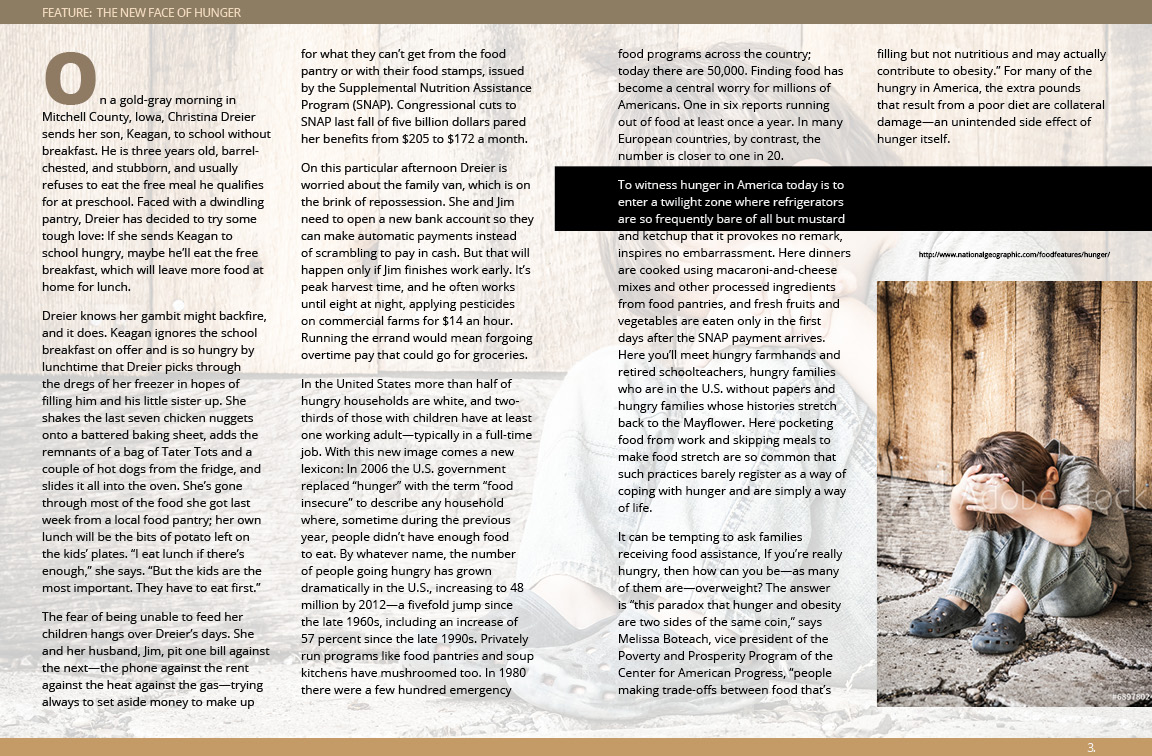
For Exercise 2 I decided to do 3 different spreads for the same article. I was experimenting with the the color in the imagery I used vs the color used in headlines and sub-headlines. I was attempting to create visual interest playing off of the different types of green and implementing them in different areas of my spreads. I'm wondering which style is the most interesting to you all, and what I should change to create a more organized spread. Any feedback is appreciated as I am submitting this late (my apologies). Thanks for taking a look! 

- David Perricone


Michael Eggerl - Exercise 2


This graphic (above) represents my attempt a full spread for the feature start.
Much like those we reviewed in class this past week.


This graphic (above) represents my two-column presentation as a continuation
from the previous graphic (full spread of Feature Article)


Here you'll find my two column design layout (above).


This graphic (above) represents my efforts on a custom column design.
Gutters were intentionally increased to present a easier divide in the verbiage.

----------

Please Note:  The color scheme presented here has not been changed,
as these colors have been carefully selected based on the target audience.
The changes notable here are the typefaces and layout; layout being the
primary focus of the exercise.