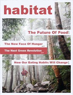
For each of my covers I tried to combine a few different
techniques from the 99 design article provided in the syllabus to create
dynamic, attractive covers. For my first cover I tried to combine light on dark
text placement, and using line to create
depth by going flowing through content in the imagery I used. The second cover I created, I wanted to play
off the little bit of color, specifically that deep maroon in the imagery used
and use the grid and shapes to create something visually interesting. The
third, which I struggled with the most, I wanted to try to create a 3d effect
by putting text and shapes behind and in front of the image. I actually enjoyed
the cover at first, but couldn’t find a proper spot for the subtitles and cut lines.
I also added a fourth cover which I
started, but decided to scratch for feedback. Thanks for taking a look, see you
all in class!
- David Perricone


David – Based on the images you have chosen, I can see that Layout #3 makes most sense in terms of connecting to the subject matter. I’m not sure any of the other image choices accompany the intent of the theme. Of course, if you use this image here – it can’t be used inside. But… it’s a very strong image, with the sun bursting forth and the dramatic camera angle. So, I’ll limit my comments to this layout.
ReplyDeleteMasthead – the outline variation of this font appears quite dated. Instead, I encourage you to use the masthead I see in Layout #1 – it’s very clean and modern, and the borders that extend down the edges of the page help the composition hold together. Not sure the cutlines need to be attached to this border… the border itself is enough.
Colors – you could use some brighter colors here. The masthead should be in color - that will help. I wonder if you’ve cropped out a bit too much in the lower right of the image…or, maybe that white triangle down there should actually be a color. What is your color palette? It’s ok to have subdued, off-hue and neutral colors… but you simply need more of them here. The design looks faded, like a 1950s design (because the printing process was much more limited than it is today). It needs to look contemporary and new.
Typography – I’m still not quite clear about who your audience is, but the theme and cutline font is quite feminine. Is that your audience? If not, consider a change.
Composition – I wonder if you should actually keep words off of the sun. Are you placing elements in what could/should be an important part of the photo? Maybe the theme could be place up nearer the masthead, reduced and designed to sit as part of that element? Then, the placement of the cutlines would be based on completing the Balance of the page. You don’t have to use all the cutlines, and maybe your design should only hold 1 or 2?
Hope some of this helps!
Cover 1 - Four covers to choose from, awesome. All four certainly have their “look,” but I’ll go in order here. For cover one, I’m not sure what this magazine is about. I think I get the visual of the trees and possibly conservation and link here with the child and the future of trees. But the white lines and the typography of the features seem misplaced. Just a thought. I had a hard time with this exercise myself. As for the masthead typography, I like it, the simple block “habitat,” is easy to read and catches the eye. The typography for “magazine,” kind of gets lost, but that could always vary based on the imagery was chosen for that month.
ReplyDeleteCover 2 - This is my favorite of the four covers. I’m not a fan of the blocking of text but for this magazine cover design it works well. I think this may be because of the masthead’s design with the white block background and how this carries forward tot he features. The placement of the features with the chosen imagery are a good fit. Overall I think this design works the best of the four.
Cover 3 - The creative design here I felt was unique and very eye catching. Great job on this cover work. I think the triangle on the top left isn’t needed. Unless that is, an element found throughout the magazine and required part of the overall design guide of the magazine. I like the selected typography you’ve used, but I’m not sure that the feature(s) typography works with the masthead typography.
Cover 4 - Very simplistic. I like it, but I don’t see this effort as a magazine but more of a brochure or other form of literature. I see you’ve continued with the triangles in the corners. I would be sure to include those as a graphic element throughout the magazine to stay consistent. I would also consider at least putting a volume and date on this cover somewhere.