
This graphic (above) represents my attempt a full spread for the feature start.
Much like those we reviewed in class this past week.
This graphic (above) represents my two-column presentation as a continuation
from the previous graphic (full spread of Feature Article)

Here you'll find my two column design layout (above).

This graphic (above) represents my efforts on a custom column design.
Gutters were intentionally increased to present a easier divide in the verbiage.
----------
Please Note: The color scheme presented here has not been changed,
as these colors have been carefully selected based on the target audience.
The changes notable here are the typefaces and layout; layout being the
primary focus of the exercise.
Michael – I’m glad you continued the article over 4 pages, since the body copy doesn’t start on the 1st spread. Some thoughts:
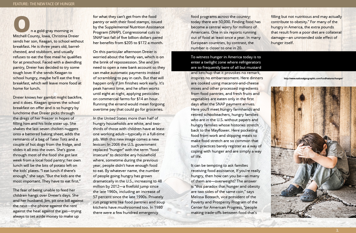
ReplyDeleteLayout 1 (both spreads) – First 2 pages are a strong opener for a strong article. I do question your contrast treatment of the typography. It seems like you are emphasizing the words “New Face” rather than “Hunger.” In fact the word “Hunger” gets a bit lost. Be careful with this – it’s important that we quickly connect the image with the idea of hunger, and not something else. (Is he lonely? Is he in time out?). The second spread associated with this design holds a repeated ghosted image in the background which is good for the unity between spreads. I also appreciate the running head that sits top left – reminding me of the title. Good, since we’ve left it behind on previous pages. The sunken first column and drop cap all work well to get me started reading. I do question the photo selection here – too similar to the one we just saw… so it doesn’t add anything to our understanding of the subject. Yes, it “fits” well and is clearly part of a series – but that’s not enough. What other images could/should be used? A family? A young student heading off to school? An info-graph to visually interpret the U.S. statistics? I trust that you will use photoshop to make sure the image continues your restricted color palette. Lastly, the dark black shape at right that sits behind the type would be more successful, in my opinion, if it moved behind a column quote – and not behind an incomplete section of body copy. What will you do in the last column area where this shape comes across? Should the column quote move across both columns to more fully fill this shape? Resolving this area will help the finish this off.
Layout 2 – You have pulled out a good section to place as a side bar in far right column. Nice. I’m wondering why the title is so small? This is a feature, and should not be confused with a department and its smaller sized headings. The bars of color at page edges work well, and if you were to add more negative space around a larger title, increase the photo size, and allow this article to spill over onto a 3rd page – this could be a strong design.
Layout 3 – No photos? No can do – this has to have some image(s) to engage the reader in the subject. I have a number of other questions/comments – but I’ll leave it here.Refining one of the other layouts would be a better use of your time.