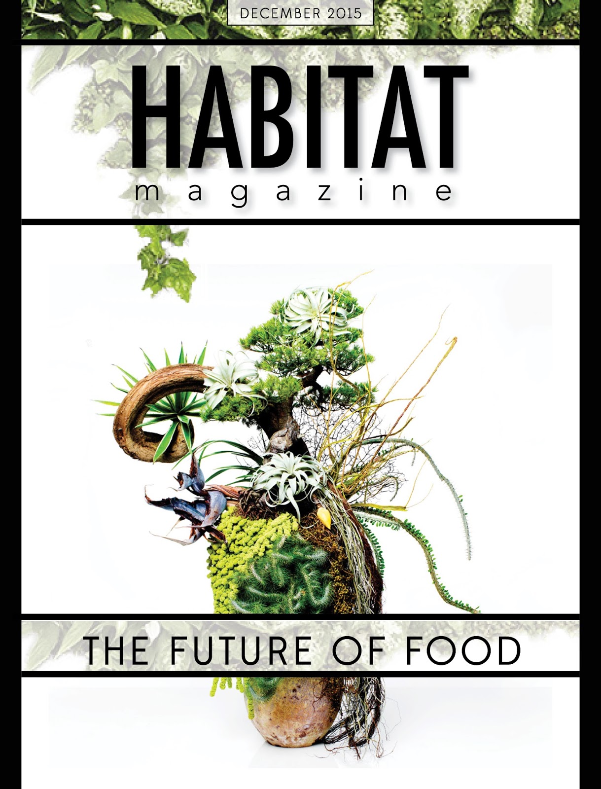
Showing posts with label David Perricone. Show all posts

Tuesday, September 22, 2015

Perricone_final

Habitat Magazine

Habitat Magazine is a magazine issue about life choices in a changing world. Topics that include but are not limited to: foods, farming, climate change, health, and world events. This particular issue has a focus on food, specifically what the future holds for it. Since this issue has a focus on the future it a very modern futuristic feel and style.  This issue has one feature article and five department articles.


Target Audience

 My target audience are young professionals in their mid twenties to early thirties with an average income between 100k-300k. Those who are trying to better themselves, be informed, and understand what is happening in the world, but more importantly, if and how it will affect them. Habitat’s target audience is consumers, somewhat selfish, and very new age. They enjoy modern design; Habitat magazine reflects this.

This issue includes the following articles:


Features:

 • The Next Green Revolution

Departments:

 • Editor: Notes From The Editor
 • Table of Contents
 • In Your Backyard: The Future Of Farms
 • In Your Backyard: Future Frontiers
 • Climate Change Means One World’s Death and Another’s Birth

PSA:
 • Don’t’ Text and Drive

 Ad:

 • Sony AFR

Final Spreads: 


Wednesday, September 2, 2015

Perricone TOC

Hey Everyone ! So this is my table of contents, I kept a lot of the same themes i've used throughout my version of HABITAT, let me know what you think! I'm still making some adjustments but I wanted to get it up here so I could get some feedback and make some changes before class tomorrow, see you all then!


Wednesday, August 26, 2015

Perricone_Rework


So, with all the feedback i've been getting in class since we began the style guide, I decided to start from scratch. I still used most of my general layout guides, but for the most part completely re-vamped each assignment with new typefaces, images, and changed the actual articles. The images used now are far more fitting for the content, and I had some fun in illustrator and photoshop with them before putting them in my actual spreads. ALL feedback is appreciated because these are far from finished, so please let me know what you think, thanks everyone!

- David Perricone

Wednesday, August 19, 2015

Perricone Exercises 3 & 4 Revised


Here is my new style guide, with an updated summary, audience, typefaces, and narrowed down color palette. For the cover, I combined elements from two of my covers and created a design that makes sense. I'm still tinkering with the magazine title. Thanks for taking a look, see you all in class tomorrow.

Tuesday, August 11, 2015

Perricone_Exercise 3

For each of my covers I tried to combine a few different techniques from the 99 design article provided in the syllabus to create dynamic, attractive covers. For my first cover I tried to combine light on dark text placement,  and using line to create depth by going flowing through content in the imagery I used.  The second cover I created, I wanted to play off the little bit of color, specifically that deep maroon in the imagery used and use the grid and shapes to create something visually interesting. The third, which I struggled with the most, I wanted to try to create a 3d effect by putting text and shapes behind and in front of the image. I actually enjoyed the cover at first, but couldn’t find a proper spot for the subtitles and cut lines.  I also added a fourth cover which I started, but decided to scratch for feedback. Thanks for taking a look, see you all in class!


- David Perricone


Monday, August 10, 2015

Perricone Exercise 2

For Exercise 2 I decided to do 3 different spreads for the same article. I was experimenting with the the color in the imagery I used vs the color used in headlines and sub-headlines. I was attempting to create visual interest playing off of the different types of green and implementing them in different areas of my spreads. I'm wondering which style is the most interesting to you all, and what I should change to create a more organized spread. Any feedback is appreciated as I am submitting this late (my apologies). Thanks for taking a look! 

- David Perricone


Wednesday, July 29, 2015

David Perricone Assignment 1


         I adapted my design to each template as according. I used powerful photography and visually interesting headlines  to pull the reader in. My target audience is in the early 20 to mid 20's. Modern feel was my intent, I branched out a little to a more traditional feel for the second design. I went really out of my comfort zone with the 3rd and had a bit of fun with it.