A blog for Summer 2015 NEiA Publication Design class with instructor, Coni Porter. The purpose is to offer faculty and peer feedback in a timely manner, allowing and encouraging the students to progress in a focused and productive way. As the semester ends, this class has produced 117 posts, 263 comments, and been viewed by over 5,000 internet readers. See the last group of postings below to view final student work: sample pages for the (fictional) Habitat Magazine: The Future of Food.
David – these pages look quite nice, and your cover and first spread are great.
Page 4 and 5 hold repeated versions of your department icon/bar. You only need 1 on this spread. Which will it be?
Page 7 holds a block quote which needs more leading, I think I see the descenders and ascenders hitting each other.
Page 8 holds an image that invades page 9. Good. However, once this is trimmed and folded, I wonder if you’ll wish you had enlarged it enough to actually center it on the page so it bleeds off to the left and continues its invasion of page 9. This is hard to describe I think. Hmmm… Ok, try again. Look at the quote that sits above this polygonal-shaped image. It is centered on the page. In my opinion, so should the image be centered. BUT, I love the bleed over the gutter and how the text wraps around the edge of the image. So… How can you keep that happening and also center the image on the page? Solution: enlarge it enough to bleed off the left edge of page 8 (and maybe it will need to bleed off the bottom as well). Hope that was more clear.
Page 11 could possibly hold a light background color. Pay attention to the type alignment, and decide whether to enlarge the top text or the bottom text… one of them needs to take control… presently they are the same weight on the page, so we don’t know where to look first.
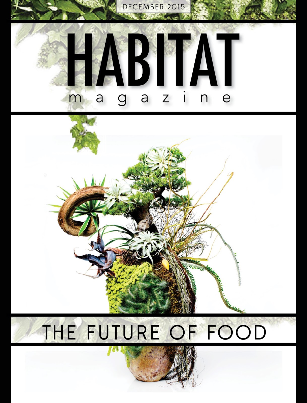


David – these pages look quite nice, and your cover and first spread are great.
ReplyDeletePage 4 and 5 hold repeated versions of your department icon/bar. You only need 1 on this spread. Which will it be?
Page 7 holds a block quote which needs more leading, I think I see the descenders and ascenders hitting each other.
Page 8 holds an image that invades page 9. Good. However, once this is trimmed and folded, I wonder if you’ll wish you had enlarged it enough to actually center it on the page so it bleeds off to the left and continues its invasion of page 9.
This is hard to describe I think. Hmmm… Ok, try again. Look at the quote that sits above this polygonal-shaped image. It is centered on the page. In my opinion, so should the image be centered. BUT, I love the bleed over the gutter and how the text wraps around the edge of the image. So… How can you keep that happening and also center the image on the page? Solution: enlarge it enough to bleed off the left edge of page 8 (and maybe it will need to bleed off the bottom as well). Hope that was more clear.
Page 11 could possibly hold a light background color. Pay attention to the type alignment, and decide whether to enlarge the top text or the bottom text… one of them needs to take control… presently they are the same weight on the page, so we don’t know where to look first.
Back cover has yet to come I see.