Showing posts with label Erica Savard. Show all posts

Thursday, September 24, 2015

Savard_Final


Habitat Magazine
Habitat Magazine covers issues regarding healthy eating, childhood hunger and agricultural issues. This issue is geared toward women who are building families and have (a) young child(ren) no older than 10. These women have some sort of higher education and have a career but also have time for their family. Their main concern is keeping their family happy and healthy.
This magazine issue uses bold colors with a pairing of neutrals.

Typefaces:
 • Bell MT
 • Dancing Script
 • Headline One

Color Palette:


This issue includes the following articles:

Features:

 • The New Face of Hunger
• How Our Eating Habits will Change

Departments:

 • Ten Healthy Lifestyle Tips for Your Family
 • Underused & Overlooked
 
PSA:
 • Clear Difference Foundation

 Ad:
 • Rubbermaid

Final Magazine:


Tuesday, September 15, 2015

Color change

Hello again,

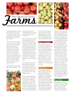
I changed the color of the berries. I saw "golden raspberries" at the store the other day and thought why not just change the color to match my color scheme! Too much? Or good? I did not like the red, but I like the picture alot.

Hello all!

I worked on a spread and would like some feedback on it. I'm not sure how I feel about it. I'm not sure if the color of the berries throws the color scheme off.

Also, I have my PSA which will go on the back cover of the magazine. I used the organization I came up with for another classes project.
Let me know what you thin! Thanks!


Monday, September 7, 2015

Savard - Revised TOC

Hello!

I revised my Table of Contents alot. I filled it with more pages because previously I had too much negative space around. I chose to have 4 features and just highlight those.
 Also, the folio will probably change, so just ignore that for now.

Please let me know what you think. Again, I have had some trouble with this page, so lots of feedback would be really helpful!

Thanks so much!

Wednesday, September 2, 2015

Savard_TOC

Hey guys!

The inspiration for my table of contents page came from "allyou magazine". They use chunking and big photos to engage the reader and I really tried that here. I did try to just have a list, but it was very basic and boring and not what I wanted. I'm wondering if there is too much negative space, or if the negative space works. I also am not completely sold yet on having a 12 page magazine, and if I have time, I might make it 16 pages, which means this page could be filled up more. Feedback would be great! I struggled with this one.

Wednesday, August 26, 2015

Erica Savard - Design Brief & Rework

Hey guys,
I was not in class last week, so I have my design brief below. I got feedback from Coni last week and reworked what I had as needed. I only had to change minor things for each exercise, like incorporating my color pallet and new typefaces.


I extended the article that I used for the spread. my thought on the extension was to bring some elements into the next page to have it coordinate with the spread. Feedback on that would be very helpful. I'm not sure yet how well it works together.
Thanks!


 The other sections are below, but not much has changed.


Tuesday, August 11, 2015

Savard- Exercise 3

Hey guys!

So I decided to change my target audience ( I hope that's okay, Coni!).
My new target audience will be mothers of young children (up to age 10). I feel my previous designs fit that audience more and its an audience I've never designed for before.
For my designs, I tried to find photos that were completely different from each other and go from there. I wanted each picture to have a child in it (because of my audience), or resemble a family.


Wednesday, August 5, 2015

Savard- Exercise 2

Hey class.
Here are my spreads for the feature articles.
Again, my target audience is young adults, ages 22ish to 35.
I wanted to take completely different approaches for each one to see what I could come up with.
I think the first spread would be more geared to an older audience, so I'm not sure about it. The second layout is outside of how I normally design, but I'm hoping it works. I wanted it bold and to almost scream through the page. And for the third one, I tried out justified type. I'm not sure how well it worked, if at all. But I gave it a shot, and would like some feedback on that.

Thanks!


Monday, August 3, 2015

Erica - Revision, Exercise 1

Here are my revisions using the department articles.
Again, my target audience is young adults, ages 20-35. All of them are different from another and I don't think would work well in the same magazine. But I did this to try different layouts and color pallets. I'm not sure what direction to go in. The second layout is the same as one of my first attempts, but with minor changes.