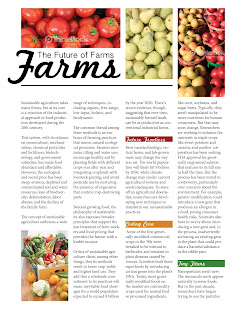
Here are my revisions using the department articles.
Again, my target audience is young adults, ages 20-35. All of them are different from another and I don't think would work well in the same magazine. But I did this to try different layouts and color pallets. I'm not sure what direction to go in. The second layout is the same as one of my first attempts, but with minor changes.


Erica – all these are successful layouts in their own right. #1 layout is a strong, straightforward design – and could work as a department if you included a small icon that would “mark” it as a particular department. The #2 layout looks currently more like a department because of your playful Bheads in their colorful boxes and the variety of photos. I also enjoy the clever margin rules in #3 – which seem to give this a light hearted, young appeal (although you might need this to be a right hand page, so the folio can help balance the page as it sits in the lower right). So – what you’ve done here is good work! You will now choose one of these to submit as a printed page. Consider adding that Department icon (that you should design) to the one you choose, as well as a page # and running foot (with name of mag, or name of issue). Again – nice work.
ReplyDelete