Habitat Magazine - Final Spreads
Dan Nazar

THIS ISSUE
Habitat Magazine is a publication that wishes to broaden the
knowledge of its readers as they attempt to lead healthy lifestyles and make
their way through their twenties and college years. This issue of Habitat
focuses on the “Future of Food” – where are food will be coming from and what’s
happening to the food we’re eating now. These issues are important and deserve
to be read and understood, especially by a generation that is going to be marked
by the changes.
DEMOGRAPHICS
The Habitat Magazine brand’s core demographic searches for
college aged readers, 20-25, typically male, who are interested in living a
healthy lifestyle and wanting to know more about the world they’re growing
into. These readers want to know about what’s going on in our society and world
while not wanting to read a fact or data heavy article that could put them to
sleep. These readers are attracted to bold imagery, and text. They like
provocative and riske. They like it simple and clean, they don’t want to have
to think – heaven forbid. This publication attempts to bridge the gap between readers
who mindlessly read the pop-culture magazines and those who read more
sophisticated publications, such as TIME. The demographic is still young enough
that color attracts their eye and while a more dulled color pallet could be incorporated,
a brighter color pallet translates better on screen. The design of the
publication was done so that that main elements would transition to mobile
devices easily. The demographic of the magazine spends much of their time on
their mobile devices, so readership must capitalize on that knowledge. A mobile
version of the magazine is available for purchase every issue.
CONTENT & CONCEPT
The color pallet consists of a red, a green and a blue. The
colors are bright and triadic. They work well when paring together and they
work well separately throughout the issue to define and highlight areas. These
colors translate well to mobile devices and paired with bold black and white
backgrounds – allow the colors to vibrate off the page.
The type choice was tricky to pin down at first but the
typeface Lubalin Graph was chosen as the logo font. It is bold and graphic. The
slab serifs ground the typeface and add a tone of masculinity and seriousness
to the publication, while the geometric counters and style of the typeface
gives it a modern and young look. The body copy of department articles was
shifted to Futura Condensed, which gives ample room for articles to fit while
maintaining the feel of the publication. The body copy for the feature articles
is a bit wider, Maven Pro Light widens the articles out and plays off the
geometric logo typeface. The main headings are also in the logo typeface, while
also using a thin secondary font Bebas Neue to balance the bold Lubalin.
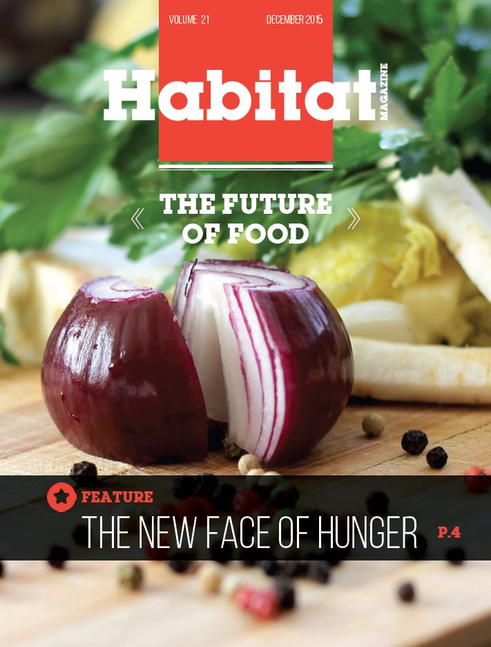
Image choice is probably one of the most important pieces.
This demographic likes photos still, it helps to peak their interest and get
them to start reading. The cover has a bold photo of a woman with bright red
lips eating a red chili pepper. This graphic is provocative enough to catch a
guy’s attention while also sending the message of food. The photos within the publication
attempt to equally be bold, so when a reader is flipping though they will stop
and read.