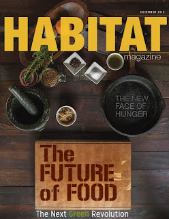
So this week for my blog, I wanted to post two cover
editions. I made a few revisions on my cover based on the feedback from last
week (cover 1) such as thinning out the border and taking away one of the cutline
and shrinking the point size of the word magazine. What do you guys think of
the hierarchy right now? Is it still too cluttered? (Cover 2) I went for this whole redesign, for
a super clean and an all around change. I want to add the yellow to my color
palette if possible, does this work? I kept the same large typeface for the
masthead but added some effects of embossing in Photoshop for my cutline. I
wanted to make it look more one with the image than text on top. Also for my
rework in (department article) I adjusted the spacing for the sidebar text, adjusted
the weight of the word “Overlooked” to a thicker point size.
I want to know what you guys thick o my color palette and if
the yellow works?
Do I need to make the typeface larger and the spacing larger
for my department article?
For the covers which is preferable?
Which elements are strong is there anything I can combine
any thing from one to the other?


Izzy,
ReplyDeleteFor your cover designs, I really liked your original design, but now I LOVE the new design (bottom cover). The masthead is SO strong. By extending it across the entire top it makes the "magazine" appear much less dominant in comparison to "Habitat" without it being too small.
The texture you created for the title works even better here than it did on the grocery bag! And the placement of the cutline is clever.
My only suggestion would be to play with moving the "The Next Green Revolution" around the page. I feel like it seems just placed there. Maybe trying making it stand out with an icon or glyph next to it. Or maybe find another clever place to put it. It might end up there, but its worth seeing if it fits better in another place.
Hey Izzy, I agree with everything Brittany said about your new cover design. The New one is amazing, I love that you played the image and text off of each other. Also I see absolutely no problem with the yellow, I think it's fitting.
ReplyDeleteI also like what you did with the department article, I would have to go back and see your prior version to really sit down and compare but this version feels like a finished piece, good job!
Hi Izzy -
ReplyDeleteWe talked a bit about yours in class together. The new cover is much more suited to your target demo in my opinion, adding the page number to the cut line "The New Face of Hunger" and removing the cut line at the very bottom are the only two things I would change, as we discussed.
The dept. article is really strong, the intro text is a bit close for comfort to the blue margin and as we discussed as well, the breaking of "Underused" between the D and E in colors, is odd. But those are quite small compared to the overall layout.
Dan
Izzy – so, I’m about to throw another contrary opinion into the mix… I like the values and colors of cover #2, but the shopping bag seems to speak more directly to the “Farm to Table” audience you identify in your design brief. And the clever type placement on the bag is quite nice. Consider using a dark background in Cover #1, which will contrast nicely with the white bag… and allow you to use this great yellow, sunshiny color for the logo. A mixture, in this way of the 2, might be just the answer to the best design. I could spend some time talking about the issues I see in Cover #2, but instead I’ll move on to the other page I see here.
ReplyDeleteDepartment: I agree with Dan, when you break apart a large compound word (Under-Used) it’s really nice to separate it between the 2 words. We DO read “Und” as a word for a second… which is a bit confusing. Can you experiment with the size of the words in this heading, so that the color break (between white letters and blue letters) happens in this way? The intro paragraph needs to sit more comfortably in its spot. Currently there is trapped neg space above and below – which you could easily address with an increased inset on the sides, and increased leading. You do not need a continued line at bottom right unless there is a “jump” involved. And… you don’t have to continue this anywhere… it could be a 1 page department… it looks pretty complete as I read it.